Homemade URL Shortener for Twitter

Earlier this year, I read (ate up) Michael Hyatt’s Platform: Get Noticed in a Noisy World. Hyatt’s thorough and generous explanations of his own branding and self-promotion dragged me–with a little less kicking and screaming–into the world of social media.

Much as I dislike social media, I know that I must at least understand them–for the sake of my clients. So, I set about trying to put Hyatt’s advice into practice. In one chapter, Hyatt discusses Twitter and the usefulness of URL shorteners. Since Twitter only allows 140-character tweets, any links you place in a tweet had better be short. Hyatt’s solution is an off-the shelf product from HootSuite along with a short vanity URL (e.g., http://mhyatt.us). His solution (also described on this post) is probably very good for him or anyone else pumping out as many posts and tweets as he does, but for part-timers and startups his solution is quite expensive (latest check, at least $59.98 per month). I devised my own solution.

A Home-Brewed URL Shortener for Tweets
I have a short last name: Hepp. That plays well into Hyatt’s idea of using the vanity URL. So I registered bhepp.us. That costs me $10 per year at my hosting service (Dreamhost). On my Dreamhost account, I used the one-click installer to create a free WordPress Web site (the site you’re looking at now!). By adding a simple, free redirection plugin, I can now create my own shortened URLs for any of my pages or posts, no matter how long the actual URLs. Let me demonstrate how I’ll do that with this post.

  1. Create post and get its long permalink URL (for this post, that would be https://www.bhepp.us/2012/12/homemade-url-shortener-for-twitter)
  2. (Update: As Wayne Stiles points out, this step is not necessary; just choose a short URL to use in the Redirection plugin…Step 3; the dummy pages that I was creating may still serve some useful purpose). Create a blank page with a short name (I have a parent page named “r” for redirects, and I create a child page to represent each new post). For this post, the accompanying blank page will be bhepp.us/r/r10 If I didn’t use the parent page, and dispensed with the “r” prefix, that would be three characters shorter: bhepp.us/10 !
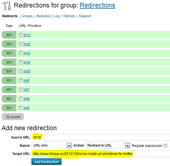
  3. In the Redirection plugin, redirect the page with the short name to the post with the long permalink:
twitter-url-shortener

Browser Wars and Designing Websites for Non-Profits

Website designers (myself included) will sometimes tell you that they despise Internet Explorer. They find it extremely difficult to make their shiny new websites look and work right in IE. They’ll point out that everything looks right in Firefox or Chrome. Must we really go the extra mile to accommodate older, non-conforming Web browsers?

ONE MEAN-SPIRITED SOLUTION

Here is what I recently found one large “cutting-edge” design firm doing for their non-profit client (I have altered the image below to protect the client). Instead of building their website so it would work in “older” versions of Internet Explorer (version 8 and older), they set a popup to initially obscure each and every page for unlucky IE 8 visitors. It helpfully(?) announces the visitor is using an outdated browser, and suggests ways they could be less stupid.
Non-Profit Website with annoying browser popup

Of course they do not explicitly accuse the visitor of being stupid, but isn’t that what many visitors will infer? For years now, they have had very little trouble surfing the Internet with IE8, and suddenly they stumble upon this site that tells them they are doing something wrong.

WEB DESIGNERS ARE DISPROPORTIONALLY BIASED AGAINST IE8

If you do a Google search for “browser statistics,” the site that currently comes up first is W3Schools. Are their stats authoritative? Yes, but with a huge caveat that they themselves state:

Statistics Can Be Misleading

You cannot – as a web developer – rely ONLY on statistics. Statistics can be misleading.

Note: W3Schools is a website for people with an interest for web technologies. These people are more interested in using alternative browsers than the average user. The average user tends to use the browser that comes preinstalled with their computer, and do not seek out other browser alternatives.

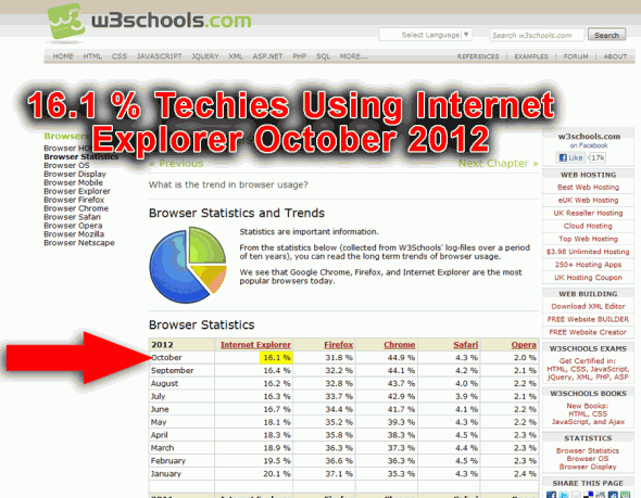
Here’s W3Shool’s current graph (I added the red annotation):

Click on the image above to view current statistics at W3Schools

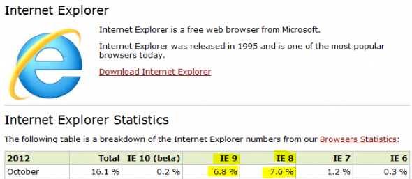
So, only 16% of techies currently use Internet Explorer! If you drill down a little more at W3Schools, you discover that the current breakdown of that 16% is 7.6% using IE8 and 6.8% using IE9.
Of the techies who visit the non-profit website represented above, only 7.6% are going to experience the annoying popups. That’s not so bad. But wait! Did the non-profit organization engage the design firm to create a website for techies? NO! Their target visitors are “normal” people with above-average compassion and philanthropic leanings. Their goal is to get donations, not to impress the visitor with bleeding edge technology.
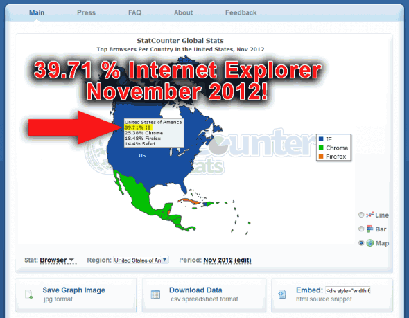
What percentage of “normal” web visitors use Internet Explorer 8? Here’s what we learn from viewing more representative data, at StatCounter.com, where they gather stats from more than 3 million websites:

4 out of 10 (Wealthy) Americans use Internet Explorer
Click on the image above to find current stats at StatCounter

Let’s assume that the IE8/IE9 breakdown is similar to what we see at W3Shools…. Somewhere over 20% of American visitors (read wealthy American visitors with disposable income!) will view the non-profit’s site with IE8. One in five of their visitors will have a miserable experience when they visit the site. Will they make a donation? I doubt it.

CONCLUSION

A few years back, I designed a new website for my church: www.redeemerbiblechurch.org.  The site was not looking right in an old version of Internet Explorer (probably version 6 at that time). I expressed my concern to Daniel Ice, a fellow church member and seasoned coding expert. Daniel suggested this principle that has guided me since: “Don’t worry about accommodating visitors whose browsers are so old that they are accustomed to a miserable experience on the Internet.” What I have been suggesting in this post is a corollary to Daniel’s advice: “DO worry about accommodating visitors whose browsers are new enough that their Internet browsing experience is generally good.” This is essential if you are enhancing a client’s reputation, and not just your own.